How Clean Product Pages Earn More Trust
A practical writing guide on structuring product pages so the offer is clear, the proof feels grounded, and the call to action does not arrive too early or too late.

The strongest product pages usually do not sound the loudest. They make the offer understandable fast, then use detail and layout to keep attention. That means opening with a clear product angle, showing a visual early, and saving the CTA for the point where the page has already earned interest.
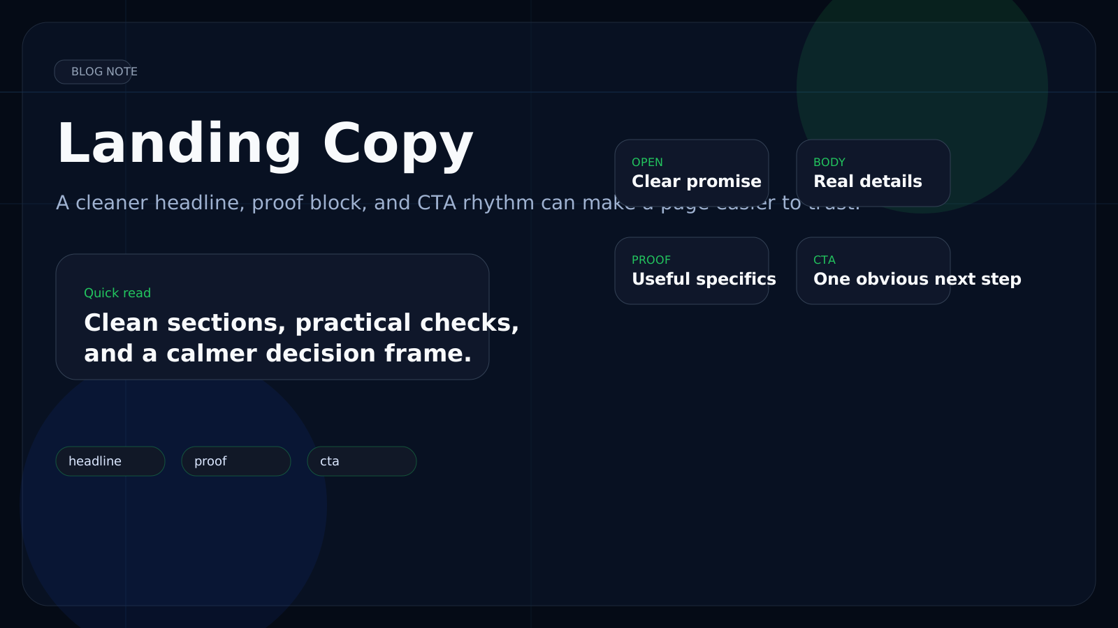
Start with the offer, not the framing
A weak opening spends too much time describing the article itself. A stronger one names the product or category, explains what it is in plain language, and gives one clear reason to keep reading. That shift alone makes a page feel more confident and more useful.
Opening copy: weaker vs stronger
Long intros that explain the page before explaining the product often lose momentum immediately.
A direct product description, one practical differentiator, and a clean visual usually work far better.
People can decide quickly whether the page is relevant without feeling pushed.
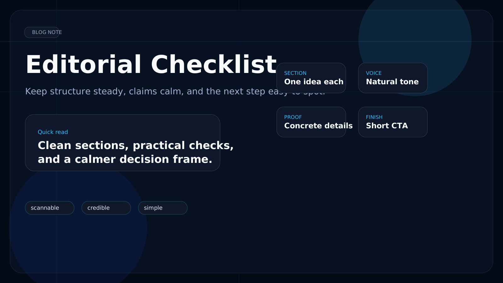
What a good middle section should do
Middle-section checklist
- Add concrete product details before making stronger claims.
- Use visuals to support the explanation instead of clustering them all at the top.
- Keep each section focused on one idea: routine, format, proof, or comparison.
- Let the CTA appear after the page has already answered the obvious questions.
In practice, most page improvements are structural. A cleaner sequence, calmer headings, and better visual spacing can make average copy feel much more credible. The page does not need more noise. It needs better order.
See the structure in practice
The Matcha Slim article uses this same structure with images placed inside the body instead of stacking everything at the top.